
Hello, and welcome to All Your Monies, where The Glorio Blog’s resident toy and figure collecting crew (and Aqua) will run down the last week’s new pre-orders, turning a loving or scathing eye over what’s been put out for you to spend your hard earned cash on. This time we’ve been out for a few weeks, so let’s gather the best of what we missed.
G.E.M. Ash Ketchum & Misty (Pokemon)
Megahouse, May, ¥5,800 each

Zigg: These are simply wonderful and a reminder of just how good those very first Pokemon designs were. Kudo to Megahouse for putting in the work to get some great poses and including a bunch of iconic mons in the packs. I ordered them.
Jel: Talk about taking care of all your Pokemon figure needs in one shot… well, technically two as these are two separate buys but you get my point. After having some exclusive, hard to get a hold of releases in the past it’s nice to see things like this and the previous Team Rocket releases fill the void. That said, I’d save your money for the upcoming Kotobukiya release of Red with Pikachu, since you know, Ash kinda sucks.
Aqua: As much as I love Megahouse’s efforts in making affordable figures of beloved characters from the Pokémon anime and their most memorable ‘mons (Psyduck!), the cheapness of the line does show in the human characters. Misty looks just a bit spacey, and like James, Ash has no nose, which is a pretty unforgivable oversight in my book. I’ll always remember Ash’s nose because that thing set Pokémon‘s art style (read: the standard anime art style) apart from all other cartoons. It was just a flat, two-dimensional spike on his face. To not see it immortalized here just hurts my feelings. Also, where the hell is Brock?
Timmy: Megahouse definitely has has a good thing going with these Pokemon figures. They look great, they are cheapish, and they come lots of fun Pokemon. Not really that big of pokemon fan myself and even I find myself tempted. I do have to agree with Aqua though. Where the hell is Brock?
Iro: I’m calling foul. Misty never had Togepi at the same time that Ash had Charmander, and in fact they found Togepi’s egg in the very same episode that Charmeleon evolved into Charizard. Clearly this is an important detail and it should bar you from buying these figures from a beloved children’s show. More importantly, where’s Brock? He was always the best one.
Yudachi Kai Ni (Kantai Collection)
Good Smile Company, September, ¥15,556
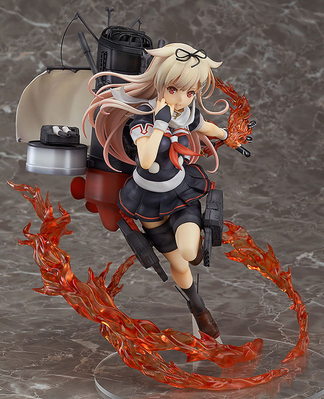
Zigg: As loathe as i am to include KanColle figures in this roundup, the subject matter has not dulled GSC’s brilliant technical ability and this is a particular standout due to the lovely use of fire effects parts, married to a dynamic pose. Add to that the usual cool mechanically-modelled ship parts, and the fact that this one is actually wearing an outfit that might even approach public decency and you’ve got a figure that’s easy to admire, though still hard to love in my case at least.
Jel: I’m sure it’s not a coincidence that Zigg has been avoiding the boring onslaught of KanColle figures from the past year or two, seeing how boring and uninspired most of them are. Basically it takes a good one to make AYM these days and this is a pretty good one. Obviously the fire effect thing is the first thing that catches your attention, but I think the pose might be my favorite aspect of it. It really elevates her design to the next level, which on its own is not much more than the series’ “schoolgirl with metal backpack” look I’ve often been critical of. To top it off she’s actually fully clothed! Definitely one of the best entries in GSC’s line.
Aqua: This is the one that says ‘poi’ all the time, right? Anyway, as with all KanColle girls, Yudachi looks generic as all hell, but I do love this all-action, no-fanservice pose. It honestly makes her look like, well, a battleship, rather than a schoolgirl with an oversized backpack.
Timmy: Yudachi certainly looks great here, especially with the action pose and ample flame effects, both of which definitely raise what could have been just another KanColle figure to the next level. Kinda expensive though.
Iro: Well, at least she’s clothed.
Angel -1st Beat- (Angel Beats!)
Broccoli, August, ¥18,500

Zigg: Angel Beats remains a surprisingly strong show for something that is basically just a parallel world version of a Key animee, and Angel has been a consistently popular source for figures. This one is certainly the biggest and most spectacular one yet, and there are a lot of things about it I like. Those gorgeous wings, for example, the cool base and the fact she actually gets to have her sword for once. On the other hand, the pose is awkward and I am absolutely not a fan of ripped clothing in figures, considering the none-too-subtle overtones. The big killer though is the price. That’s a lot of money for a figure from a lesser known house.
Jel: Oh right Angel Beats sure was a thing that happened SIX YEARS AGO. Where did the time go? That aside, Kanade is back and as good as ever with a very creative approach to the character. It’s a very cool battle pose but it doesn’t seem too far away from her personality either. One thing I will say though, when I first saw that base I thought it was a stack of cookies. Now you can’t unsee it, right?
Aqua: It’s a bit surprising that we’re still getting such an ambitious release for a show that has all but disappeared from the spotlight, but I quite like some swell angel wings on my figures, so I’m not complaining. Well… more like I shouldn’t be complaining. Unfortunately, I just don’t know what this figure is supposed to convey. How did Kanade’s jacket get ripped like that? Was she in the process of taking it off when it got burned? Why does she have her wings out when she’s on the ground? Why does she appear to be falling, while still holding her blade over her head? Just look at this. The longer you look at it, the more confusing it gets. At least the wings look nice.
Timmy: Definitely a stunning piece and while the pose does look a little odd I think lightness that the wings convey justifies it. Overall a stunning figure of Kanade mid battle. I do wonder though if Broccoli has the quality control to both match the final product to this beautiful prototype and justify the high price they are asking.
Iro: Do people still care about Angel Beats? More importantly, why does she have MagnaAngemon’s arm sword?
Master Arturia (Fate/Stay Night)
Alter, July 2016, ¥12,800
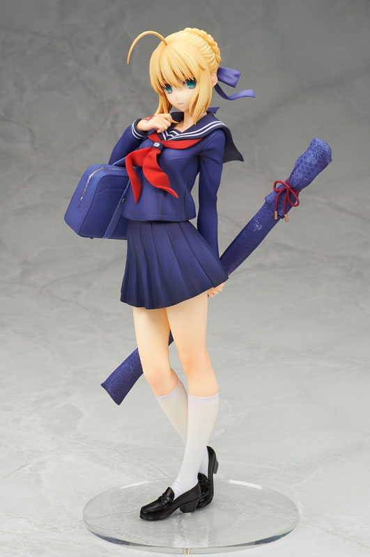
Zigg: I like the colour palette here – we don’t see the single colour seifuku too much these days and it’s a lovely rich shade of navy bordering on purple. The highly detailed sword bag is money too. But this is about the safest, most boring, most predictable figure in the world and even at Alter’s level of quality I can barely muster any interest.
Jel: We will need to call in Iro’s arcane Type Moon knowledge to explain who this character really is, but let’s be honest: it’s Saber in a plain, boring school uniform. Granted it’s a beautifully sculpted take on the Fate universe’s Cash Cow, and I particularly love the ornate details on her sword cover. But as it stands in the year 2016, after like a decade of Saber figures, I need to see more than this to really catch my attention.
Aqua: Oh hey it’s Saber only without everything the one thing that makes Saber interesting. Worst of all, why would you get this Saber-as-a-regular-modern-schoolgirl-redesign when you can get this one? Next.
Timmy: Eh, I have long gotten the feeling judging from the amount of repeat characters that Alter often makes figures of whatever strikes their fancy, and if that theory is correct someone in the company has a pretty big hard on for Saber. Do we really need a schoolgirl Saber? At the very least she will be expertly crafted and there is some really lovely detailing going on but I am just not that interested.
Iro: This was from some Fate/Zero promotional art where Takeuchi drew Saber as if she were a Master in the Grail War blahblahblah who gives a fuck, not me. Type-Moon’s going to milk this cash cow until the sun burns out.
Rin Matsuoka (Free!)
Chara-Ani, May 2016, ¥10,500

Zigg: I remain a big proponent of more shameless beefcake-y hot guy figures because, well, it only seems fair right? Rin’s got a bit of a weird pose going on but there’s some nice sculpting there and the water gun is a brilliant little bonus so it’s tough to be too judgemental. Nagisa next please.
Jel: Ah yes, this Free figure line. I like these better than Alter’s flawless but boring renditions. The waterguns and undone clothing are so much more fun than an anime perfect recreation. In this case Rin looks pretty cool here (or I guess hot depending on your point of view), but I must deduct points for not properly depicting his shark teeth. They also should’ve probably gone all in and pulled that shirt up so we can see those ABS, but I’m just nitpicking at this point. This is fun.
Aqua: Regular readers of this feature will know that I am all for more sexy man figures because the sexy men they make sexy man figures of usually seem to enjoy being sexy and actually look like the grown men they are as opposed to most sexy lady figures which are creepy and exploitative and vaguely paedophilic. Anyhoo, anyone who’s seen Chara-Ani’s Sousuke will know what to expect: random clothes being tugged, nonchalant poses, water guns and delicious muscles. Good stuff.
Timmy: I can certainly dig these Free figures, especially with the inclusion of the water pistols. I am not all that hot about Rin’s face here though as it just seems a little off to me.
Iro: We could always use more hot guy figures, I guess.
Queen of Hearts (Alice’s Adventures in Wonderland)
Myethos, October, ¥11,800

Zigg: I love the unified motif on this figure, from the chess pieces, the hearts and the overall even nature of the colour scheme, it feels like something that was designed as a set, which is rarer than it should be in the figure world. There’s a lot of wow here – the big cape and the big hair are notable points – and it’s pretty reasonably priced for something of this scale and complexity. Intriguing.
Jel: Timmy could tell you more about the background on this figure, I’ll just say it’s cool to see a new up and coming company improve so quickly in terms of quality in such a short period of time. This is a legit figure nearly on par with the Big Boys, from the crazy base to the nice textured fur effects to the detailed hair. I probably would like to see more of the playing card aspect in the design and it’s maybe just a little too monochromatic, but it’s still nice work overall. I hope they get some more licensed figures in the future.
Aqua: This is totally Timmy’s doing, isn’t it? Anyway, I quite like this rendition of the world’s most infamous evil queen. It’s seductive without being overly cheesecake-y, the abstract base is well made and suits the character well, and most importantly at all, anyone will instantly recognize this character as the Queen of Hearts. However, they’d be mistaken! After all, did you know that the Queen of Hearts (the one with the hearts and the card soldiers and the off with their heads) and the Red Queen (the one with the chess piece and the rivalry with the White Queen) are actually two entirely different characters? In the original Alice in Wonderl— Hey, where are you going?
Timmy: I have had my eye on Queen of Hearts for a while now but have held off my excitement until I was able to get my hands on their Alice to see what kind of quality to expect. Thankfully Alice turned out pretty good so the queen here was an instant order. With so much going on, from the awesome base to the exquisite cape and hair I suspect this will be Myethos’s big break out figure. I just hope they can achieve the high expectations they have set for themselves. It is also nice to get something big and pretty and not have to give an arm and a leg for it.
Iro: How many poor white rabbits died to make that fur lining? And what happened to all their pocket watches?
figma Akira Yuki & Sarah Bryant (Virtua Fighter)
FREEing, September, ¥4,167

Zigg: Silence please for we are in the presence of true beauty. Now where’s my figma of the car from Daytona USA?
Jel: These are amazing. It hits the sweet spot of being nostalgic while still being great figures in their own right, adapting to the segmented figma designs perfectly. It’s got me wondering what other old Sega properties should get the figma treatment. Virtual On? Space Channel 5? Altered Beast? The possibilities are endless. On another note, I will be very disappointed if these do not show up in a Kawaiikochan comic someday.
Aqua: Okay. Yeah. Sure. I don’t even know what to say anymore.
Timmy: Nothing screams nostalgia bait like blocky figmas. At least the price seem reasonable?
Iro: What more could you want from a figma? The answer is: nothing. We have reached peak figma.


“We have reached peak figma.”…lol im dying. Thos figmas are bad ass though. As for classic sega racing games I would rather see a version of Out Runs red ferrarbi.
Would an OutRun car be a figure or just a cardboard cutout of the back of the car?
A cardboard cutout at a cost of 4k yen would seem appropriate. But only if it’s a cutout of the OutRun car screeching through a turn. =D
My eyes almost rolled all the way to the back of my skull when I saw that school girl Saber in WonFes and the amount they’re asking for it is just… it’s such a lazy cash grab it almost makes me angry. I love the watergun Rin, but the one with the extra head (which had the ponytail hairdo) is an exclusive, which is extremely saddening